Making sense of crash data
Company: Numetric
When: 2019 - 2020
Team: 1 Designer (me), 1 PM, 6 Engineers
About Numetric
A few civil engineers at the Utah Department of Transportation recognized that turning data into decisions was cumbersome and time-consuming. They figured an automation-driven approach could fix this problem. It could enable anyone — regardless of skill level — to perform data-driven safety analysis. After that, Numetric was born.
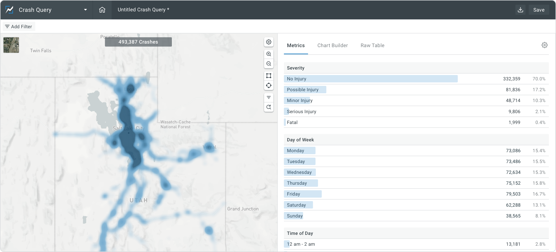
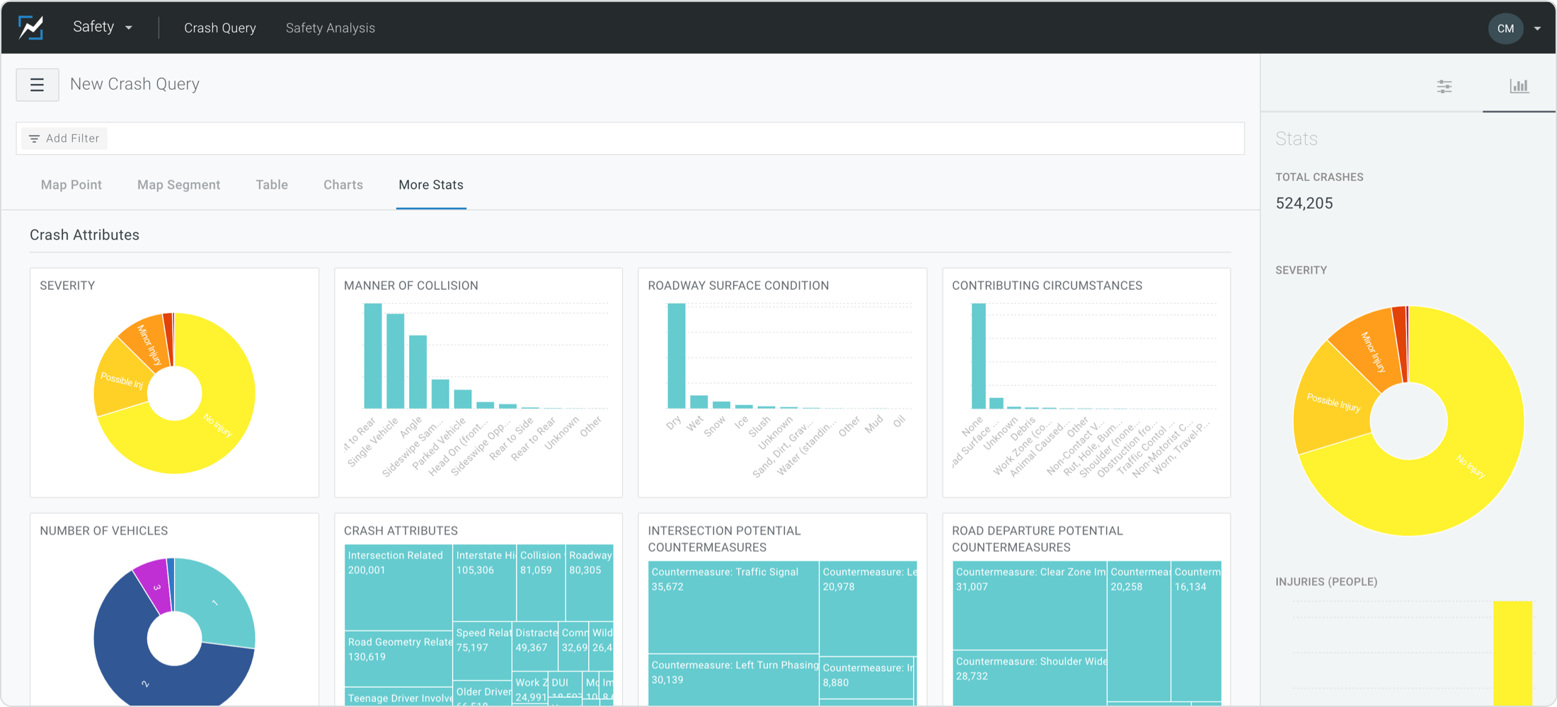
One of the first tools they created was an application called Crash Query which allowed people to explore crash data in a more familiar dashboard-like interface. The first version of Crash Query was a big step forward for safety professionals and began to uncover an underserved market that could benefit greatly from some well-designed software.
Understanding through discovery
I’m a firm believer that a well designed product is only as good as the discovery and understanding that precedes it. I had almost zero knowledge about traffic safety prior to joining Numetric. Our Product Manager and I realized quickly that in order to design a useful product we had to dive in and understand the users, their needs, and their processes.
After extensive research of white papers, documented workflows, and several conversations with safety professionals from DOTs (Dept. of Transportation) across the U.S. we began to understand which of their current problems could be solved within our product. We also began to realize some of the pain points within the Crash Query app were closely tied with some of the features we had began to ideate on based on our findings. These findings led to prioritization of product improvements that ultimately resulted in a completely new Crash Query application.
... a well designed product is only as good as the discovery and understanding that precedes it.
Identifying problems & creating solutions
Below are a few examples of some of the initial paint points (on the left) that emerged in our research. Next to the pain points are features (on the right) we built after rounds of prototyping and usability testing.
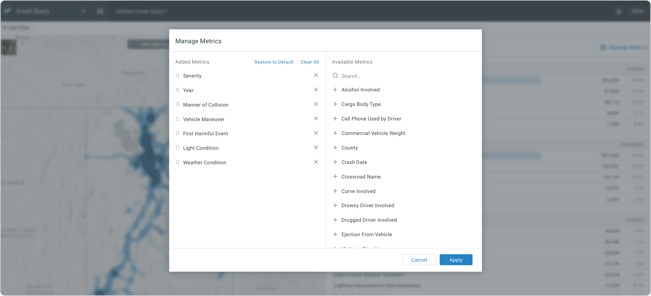
Before i. Cumbersome implementation process
Our CX Team would have to determine which metrics the customer wanted their users to track. Due to its subjective nature this process could take days and even then the chosen metrics fell short for some users.
After i. Configurations available to end users
We were able to drastically decrease the time it takes to implement new customers while empowering all users to easily pick whatever metrics are important to them (and even vary by project).
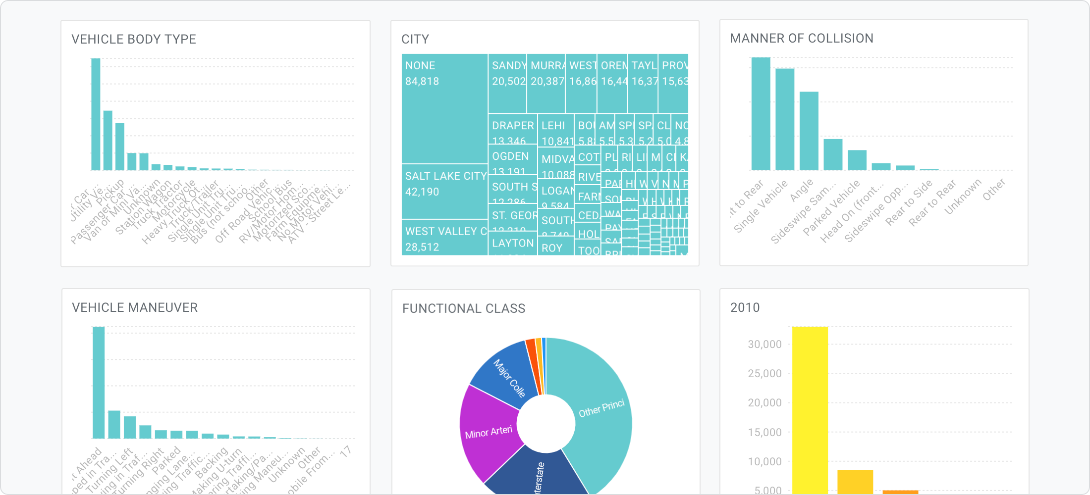
Before ii. Unreadable, inaccessible charts
The charting library we used at the time did not respond or perform well under the constraints we were imposing on it and accessibility of these charts suffered greatly.
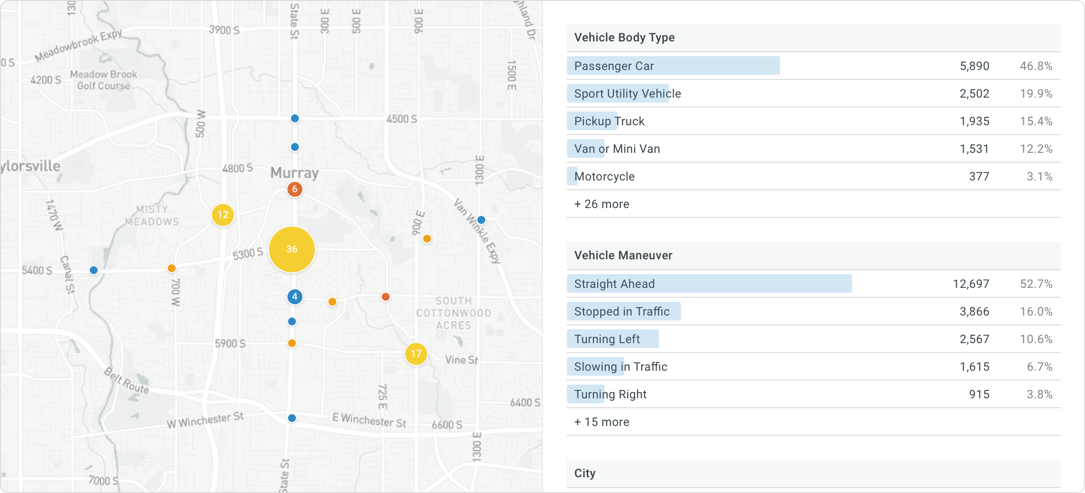
After ii. Invention of a new chart type
Instead of trying to rely on another third party library I set out to solve this by creating an all new data visualization. More on that below.
Before iii. Overwhelming visuals
A multi-column layout of metrics with varying colors made it difficult for anyone especially new visitors to get familiar with the tool without feeling overwhelmed by all the data displayed at once.
After iii. Simplified layout and added context
Because we were able to simplify how we displayed data we were able to in-turn consolidate two tabs of functionality into one. This proved to offer users additional context in their analysis.
Before iv. Gaps in processes
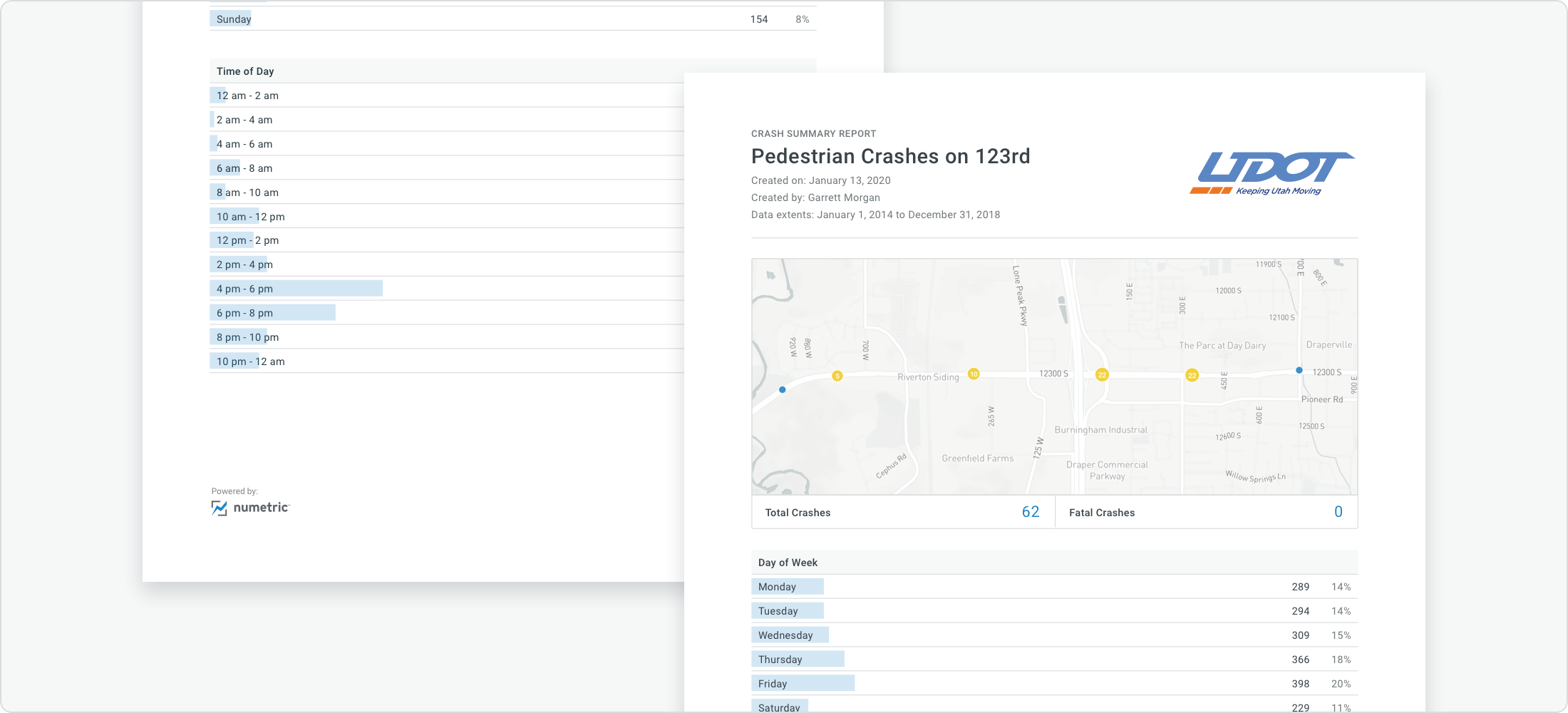
Having access to all this data was nice but there was a big need for users to export or share their studies. We were forcing our users out of our apps in order to complete their work.
After iv. Always offer an output
Contextual inquiry type interviews led to uncovering a similarity for a majority of our users. We filled a major gap allowing users to create a proffessional report with just a few clicks.
Iteration Leads to Innovation
When it comes to major redesigns I think we often have the urge to attempt to solve something too quickly. I think good product teams are patient and invest time in extensive and ongoing understanding. In this example, a more patient approach has not only proven to be simpler technically but has allowed us flexibility to solve a much broader range of use cases. Less is more, or so they say :).
It didn't take long to identify a few areas our charts were falling short. Below are some of the more obvious things we knew we wanted to solve for:
- Overwhelming information.
Too much data displayed at once especially in a dashboard context lead to cognitive overload.
- Reliant on hover interactions.
Data rendered useless when printed, shared, or displayed on touch devices.
- Not accessible.
Improperly truncated, overlapping, or hidden labels made it impossible to fully understand.
Here are some of the less obvious issues we uncovered as we pushed to iterate further and dig into understanding our users’ needs more broadly:
- Not conducive to comparisons.
For some chart types, the only way to compare two things was by showing multiple charts.
- Lost context when filtered.
A chart with one bar is not very useful.
- Cumbersome to create and maintain.
Each chart has lot of moving pieces: titles, labels, colors, sorting, legends, etc.
And here is a look at the solution we came up with:
- Ensured readability.
Considers and supports lengthy value strings AND includes counts as well as percentages.
- Fully responsive.
Works at very narrow or wide widths and performs well on touch devices.
- One size fits all.
Can collapse to show the top values or expand to get the full context.
- Allows multiple comparisons.
One metric can easily compare four sets of data without sacrificing screen space.
- Safe for printing.
Optimized to print using less ink, less paper, and improve readbility.
- Optimized for filtering
Values filtered out collapse but are always still accessible.
Function and form
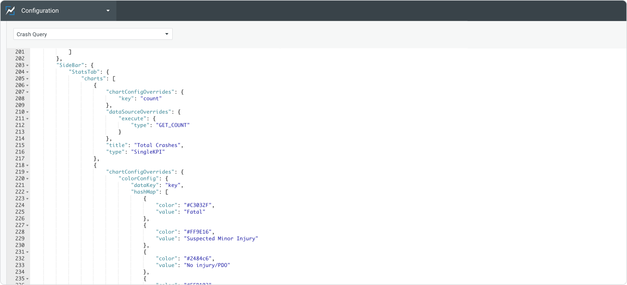
Iterative product development can some times make it difficult (or fun, depending on how you look at it) to determine how visual design improvements get prioritized. As we built out some of these new features to address customer needs I made it a point to establish a good design system along the way. As existing components were used, we took the time to also update most of the styles throughout our apps. Below are just a few examples of the new components in use:
001
002
003
004
005
Outcomes over outputs
I find tremendous joy in designing and building products. Beyond that though, the cherry on top is hearing how the tools you build make a difference in other people's lives. Since we first began researching how to improve processes for traffic safety professionals we have seen a 700% increase in customer growth (as of July 2020) and now power AASHTOWare's Safety Platform (one of the most trusted organizations in traffic safety).
This is not the end of the road (pun intended), however. Another part of product design I love so much is it never ends... there is always room to iterate and improve.
Want to hear more?
I really enjoy meeting new people. I’d love to connect and hear about the projects you’re working on. You can reach me by any of the methods below.
© - Cort McGinty